Update: Charles Franklin (of Pollster.com) kindly emailed me with many interesting points on this post. One important note is that my technique isn’t really “no smoothing” — rather, there is now implicit smoothing within the polling houses, by assuming that responses are evenly distributed across the time interval of the poll.
I was looking at Pollster.com’s page that aggregates many opinion polls on the Presidential race. Here, they have a chart that shows the many polls plus lowess fits:
So there’s a trend of Obama recently declining. But it wasn’t clear to me that the fitted curve was correct. I downloaded the data and started playing around with it.
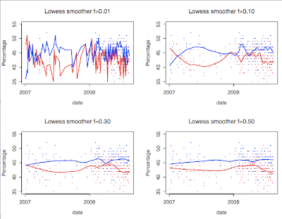
Here are several more graphs I made, with different smoothing parameters for the lowess fit. Your interpretation completely changes depending which smoothing parameter you like best!
Well, maybe this is an argument to use rolling averages over a fixed number of days or something. But it would be nice to directly look at the data with a minimum of extrapolation or smoothing, since they can destroy or mask effects.
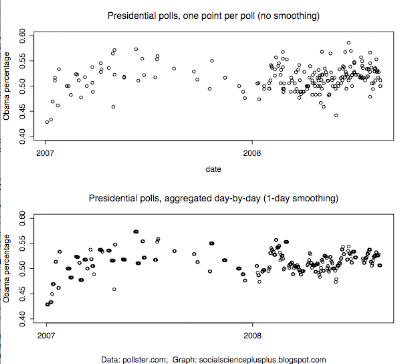
Turns out this is possible with this data set by using single-day smoothing. Every poll is taken over a range of days and the table says how many respondents there were, so I did a day-by-day calculation: take the weighted average of all polls on that day, assuming that a poll’s responses were evenly distributed over its date range given. (The weighted average across the day’s polls just means, it’s as if on that day there was one big poll and we’re just calculating the Obama vs McCain percentages for it.) And to further clean things up, I omitted polls that had “Don’t plan to vote” numbers and only included ones with undecideds. (“NV” responses wildly differ over time, so I figured if you ask it on a poll it must skew things. Not sure though. This cleanup step might be superfluous.) I know I just argued smoothing is bad and now I’m doing it, but note that the time resolution for this polling data is only at the day-by-day level, so I’m not doing any smoothing across time windows. What’s significant is aggregating across polls, binning per-day.
Anyway, I can now see some trends on the direct scatterplot. I’m only plotting the Obama percentage:
The amount of noise significantly goes down. It makes clearer there’s been a negative trend for Obama recently.
On the perils of smoothing or not — below is Gallup’s graph from their daily tracking poll, which uses a 3-day rolling average. But below that are two graphs from Alan Abramowitz, attacking the day-by-day interpretations out there — the left shows daily with no smoothing, but the right is with a 10-day rolling average.
The Huffington Post article claims the 10-day one is the safest to interpret — surely the single-day one seems too noisy — but honestly I think it’s hard to say what amount of smoothing is acceptable. (Be careful comparing those new graphs vs the official Gallup one, as they’re for different dates, I believe a week and a half off or so. The 3-day vs 10-day is somewhat similar over the same date ranges, I think?) It’s so much nicer if you don’t have to do smoothing across time windows, which is why I like my graph :). Of course, it would be best if political polling had better overall methodology and there was less noise, but that’s another (big) post…
If you’re interested in my code and the data, I threw it up at gist.github.com/5754.
Finally, there are interesting tie-ins between this poll methodology stuff and Mechanical Turk statistical aggregation. You can think of polling as a similar problem to data annotation: there is a true quantity out there in the world (the percentage of vote for Obama, or whether a certain email is spam or not) and annotators/polls are noisy signals somewhat reflecting that true value. Under certain assumptions, simple averaging is the best technique to estimate the true value. A new Dolores Labs blog post on this is coming …


Pingback: Love it and hate it, R has come of age - Brendan O'Connor's Blog