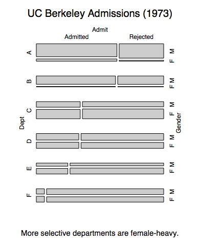
R has a fun built-in package, datasets: a whole bunch of easy-to-use, interesting tables of data. I found the famous UC Berkeley admissions data set, from a 1970′s study of whether sex discrimination existed in graduate admissions. It’s famous for illustrating a particular statistical paradox. Thanks to R’s awesome mosaic plots interface, we can see this really easily.
UCBAdmissions is a three-dimensional table (like a matrix): Admit Status x Gender x Dept, with counts for each category as the matrix’s values. R’s default printing shows the basics just fine. Here’s the data for just the first of six departments:
> UCBAdmissions
, , Dept = A

          Gender
Admit      Male Female
  Admitted  512     89
  Rejected  313     19

...
Overall, women have a lower admittance rate than men:
> apply(UCBAdmissions,c(1,2),sum)

          Gender
Admit         M    F
  Admitted 1198  557
  Rejected 1493 1278
This is the phenomenon that prompted a lawsuit against Berkeley which prompted the study that collected this data.
R’s plot function is overloaded to do a mosaic plot for this sort of categorical data. Very cool. With just
> plot(UCBAdmissions)
or, playing around after reading Quick-R’s page on this:
> install.packages(”vcd”)
> library(vcd)
> mosaic(UCBAdmissions, condvars=c('Dept'))
We have a plot showing admittance and gender breakdowns per department:

In each department, women have similar admittance rates as men. This seems to be at odds with the fact that women have a lower admittance rate overall. This discrepancy is an example of Simpson’s paradox.
This mosaic also shows the explanation: Selective departments have more female applicants. It’s easy to see since the departments are ordered by selectiveness. Departments A and B let in many applicants, but they’re mostly male. The reverse is true for the rest. This means that the overall female population takes big admittance hits in departments C through F, while lots of males get in via departments A and B.
I think these mosaic plots are impressive for visualizing categorical proportions for high dimensional data sets. Well, by “high” I think I mean, more than 2. I can’t think of a better way to see several cross relationships in categorical data at once. And the only tuning I needed to do was play around a bit with the order of those three dimensions.
Sources:
- R’s UCBAdmissions help page. It comes with the standard download of R.
- R’s vcd::mosaic function. I recommend the pdf vigenette about it, which has many more pictures of cool mosaic plots.
I would post the original 1975 Science paper, but it’s not freely available. I hate academic publishers.Here’s the paper, at least for now:- Bickel, P. J., Hammel, E. A., and O’Connell, J. W. (1975) Sex bias in graduate admissions: Data from Berkeley. Science, 187, 398–403. [PDF]
Pingback: Love it and hate it, R has come of age - Brendan O'Connor's Blog
Brendan, Good stuff!
BTW, For many more cool mosaic plots, and others, see Michael Friendly’s home page http://www.math.yorku.ca/SCS/friendly.html
> Selective departments have more female applicants. It’s easy to see since the departments are ordered by selectiveness. Departments A and B let in many applicants, but they’re mostly male. The reverse is true for the rest. This means that the overall female population takes big admittance hits in departments C through F, while lots of males get in via departments A and B.
Note that “selective” also means “popular”, since departments with many applicants can pick and choose exactly who they want to admit. In other words, the departments where women dominate are the popular departments, like English, Psychology and Sociology. The departments where men tend to dominate are the less popular ones, like engineering, etc.
A much higher percentage of English, Psychology, and Sociology students apply to grad school than engineering, math, etc, students because once they graduate they realize that a B.A. in whatever they have is worthless, and they need a better degree. That and there are more of them as undergrads to apply. Couple that with the fact that there is a significant enrollment bias of women in English, Psychology, and Sociology compared to men. It is to be expected that more women are in the popular grad programs simply because more apply.
Also, none of this is surprising, since schools force their acceptance rates to be equal for each gender. They do not take the best (for example) 10% of their candidates, they just take the 10% best candidates for each gender, lest they be sued. It’s quite sad that we can’t just choose the best.
it’s called feminism, and it is rooted in marxism.
It’s clear that you don’t know anything about Marxism and femminism. Why are so stupid to let everybody know? In any case, you are not alone. In every blog there always is a daft ignorant nationalist racist american who feels the need to show off his stupidity.
B-Con, that’s a pretty angry way to put it.
Here’s the abstract from that Science paper. I think it best lays out the situation.
Bickel, P. J., Hammel, E. A., and O’Connell, J. W. (1975) Sex bias in graduate admissions: Data from Berkeley. Science, 187, 398–403. [PDF]
Pingback: It’s Not Always Discrimination | Mormon Heretic
Pingback: It’s Not Always Discrimination | Wheat and Tares