(Update 10/2008: actually this model doesn’t work in all cases. In the final paper we use an (even) simpler model.)
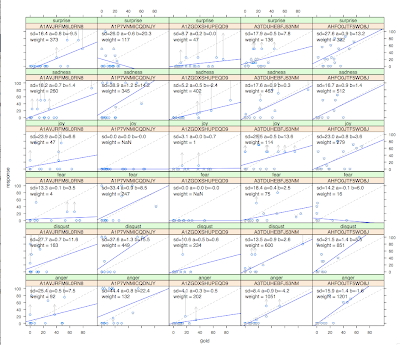
I really don’t have time to write up an explanation for what this is so I’ll just post the graph instead. Each box is a scatterplot of an AMT worker’s responses versus a gold standard. Drawn are attempts to fit linear models to each worker. The idea is to correct for the biases of each worker. With a linear model y ~ ax+b, the correction is correction(y) = (y-b)/a. Arrows show such corrections. Hilariously bad “corrections” happen. *But*, there is also weighting: to get the “correct” answer (maximum likelihood) from several workers, you weight by a^2/stddev^2. Despite the sometimes odd corrections, the cross-validated results from this model correlate better with the gold than the raw averaging of workers. (Raw averaging is the maximum likelihood solution for a fixed noise model: a=1, b=0, and each worker’s variance is equal).
Much better explanation is coming… will be a blog.doloreslabs.com post I think.
Picture!
