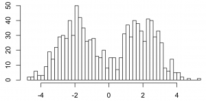
Here’s Gibbs sampling for a Dirichlet process 1-d mixture of Gaussians. On 1000 data points that look like this.
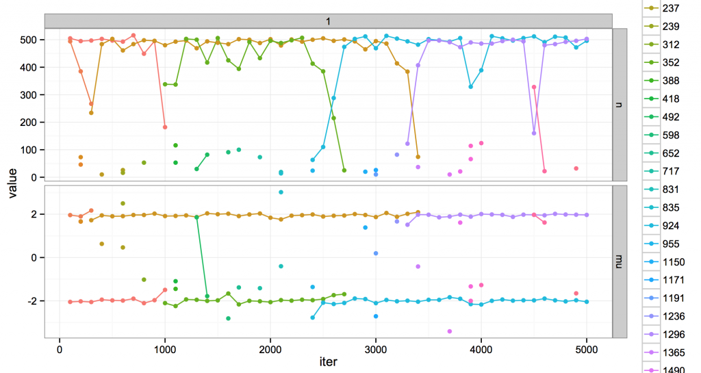
I gave it fixed variance and a concentration and over MCMC iterations, and it looks like this.
The top is the number of points in a cluster. The bottom are the cluster means. Every cluster has a unique color. During MCMC, clusters are created and destroyed. Every cluster has a unique color; when a cluster dies, its color is never reused.
I’m showing clusters every 100 iterations. If there is a single point, that cluster was at that iteration but not before or after. If there is a line, the cluster lived for at least 100 iterations. Some clusters live long, some live short, but all eventually die.
Usually the model likes to think there are about two clusters, occupying positions at the two modes in the data distribution. It also entertains the existence of several much more minor ones. Usually these are shortlived clusters that die away. But sometimes, they rise up and kick out one of the dominant clusters, and take over its space. This is evocative at least to me: for example, around iteration 2500 is a crisis of the two-mode regime, the fall of green and the rise of blue. (Maybe there are analogies to ideal points and coalitions or something, but call that future work…)
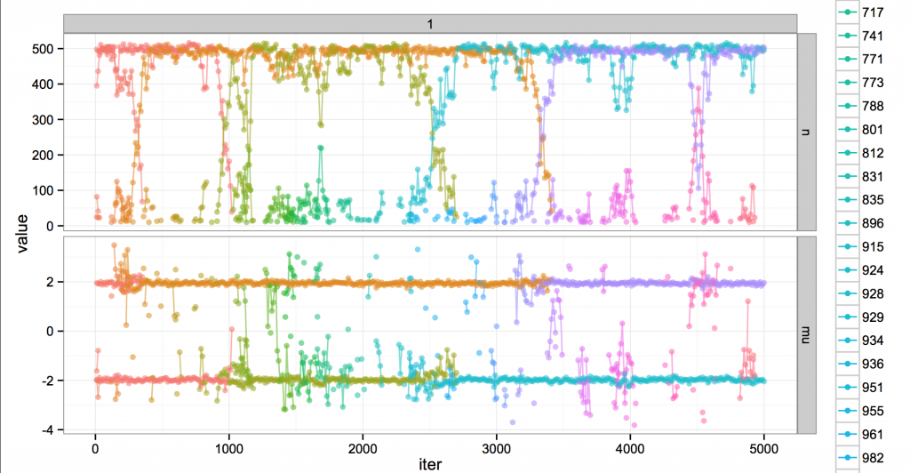
In fact the real story is a little more chaotic. Here’s the same run, but at finer resolution (every 10 iterations).
Around iteration 2500 you can see blue suddenly appear in green’s territory, where it’s bouncing around trying to get data points to convert to its cause. The clusters struggle and blue eventually wins out. Not all challenges are successful, though; e.g. at 1500 or 3600.
Ultimately, the dynamism is fake; looking at the broad sweep of history, it’s all part of a globally unchanging, static steady state of MCMC. The name of the cluster at mean -2 might change from time to time, but really, it occupies a position in the system analogous to the old regime.
Actually not just “analogous” but mathematically the same, as implied by CRP exchangeability; the cluster IDs are just an auxiliary variable for the DP. And the point of MCMC is to kill the dynamism by averaging over it for useful inference. This nicely illustrates you can’t directly use the actual clusters for averaging for an MCMC mixture model, since new clusters might slide into the place of old ones. (You might average over smaller spans, maybe; or perhaps look at statistics that are invariant to changing clusters, like the probability two datapoints belong to the same cluster. Or only use a single sample, which is at least guaranteed to be consistent?)
Technical details: this is actually a maybe-lame uncollapsed Gibbs sampler; I think it’s Algorithm 2 from Neal 2000 or something close. Everyone asks about the plots but they are easy to make; given a logfile with tuples like (iternum, cluster ID, n, mu), first melt() it, then ggplot with something like qplot(iternum, value, colour=factor(clusterID), data=x, geom=c(‘line’,'point’)) + facet_grid(~variable, scales=’free’).


Great post! Could you point out what R package or toolkit you were using for Gibbs sampling? Thanks!
I’m writing my own Java code. I grep the logfiles and load that into R. It uses some of the utilities here: https://github.com/brendano/myutil