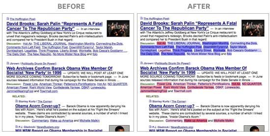
Here’s a great project from Andy Baio and Joshua Schachter: they assessed the political biases of different blogs based on which articles they tend link to. Using these political bias scores, they made a cool little Firefox extension that colors the names of different sources on the news aggregator site Memeorandum, like so:
How they computed these biases is pretty neat. Their data source was the Memeorandum site itself, which shows a particular news story, then a list of different news sites that have written articles about the topic. Scraping out that data, Joshua constructed the adjacency matrix of sites vs. articles they linked to and ran good ol’ SVD on it, an algorithm that can be used to summarize the very high-dimensional article linking information in just several numbers (“components” or “dimensions”) for each news site. Basically, the algorithm groups together sites that tend to link to the same articles. It’s not exactly clustering though; rather, it projects them into a space where sites close to each other had similar linking patterns. People have used this technique analogously to construct a political spectrum for Congress, by analyzing which legislators tend to vote together.
So here they found that the second dimension of the SVD’s projected outputs seemed to strongly correlate with their own intuitions of sites’ political biases. Talk about getting lucky! This score is used for their coloring visualization, and I personally found the examples pretty accurate. And they helpfully posted all of their output data with the blog post.
There is a concern though. The funny thing about SVD (and related algorithms like factor analysis and PCA) is that the numbers that fall out of it don’t necessarily mean anything. In fact there have been great controversies when researchers try to interpret its outputs. For example, if you run PCA on scores from different types of IQ tests, you get a “g factor”. Is it a measure of general human intelligence? Or is g just a meaningless statistical artifact? No one’s sure.
But for this problem, there is a fair, objective validation — use 3rd party, human judgments from the web! I’ve found before that you can assess media bias on AMT pretty well; but for this, I simply went to a pre-existing site called Skewz, which collects people’s ratings of the bias of individual articles from news sites. About 150 sites were rated on Skewz as well as included in the Memeorandum/SVD analysis.
Within that set, it turns out that the SVD’s second component significantly correlates with Skewz users’ judgments of political bias! First, here’s the scatterplot of the “v2″ SVD dimension against Skewz ratings. Higher numbers are conservative, lower are liberal:

So SVD tends to give most sites a neutral score, but when it assigns a strong score, it’s often right — or at least, correlates with Skewz users. Some of the disagreements are interesting — for example, Skewz thinks The New Republic is liberal, whereas SVD thinks it’s slightly conservative. That might mean that TNR links to lots of stories that conservatives tend to like, though its actual content and stances are liberal. (But don’t take any particular data point too seriously — the Skewz data is probably fairly noisy, and the bridging between the datasets introduces more noise too, since Memeorandum and Skewz are based on different sets of articles and such.)
Here’s a zoom-in on that narrow band in the middle. There’s some more successful correlation in there:

Here are the actual correlation coefficients with the different SVD outputs. It turns out the first dimension slightly correlates to political bias as well. (Joshua explained it as the overall volume of linking. Do liberals tend to link more?) But the third through fifth dimensions, which they say were very hard for them to interpret, don’t correlate at all to these political bias ratings.
| SVD component (output dimension) | v1 | v2 | v3 | v4 | v5 |
|---|---|---|---|---|---|
| Correlation to Skewz ratings | +.112 | +.392 | -.011 | -.057 | -.047 |
In conclusion … this overall result makes me really happy. A completely unsupervised algorithm, based purely on similarity of linking patterns, gets you a systematic correlation with independent judges’ assessments of bias. That’s just sweet.
Here’s the entire dataset for the above graphs. “score_svd” is their rescaled version of “v2″. (Click here to see and download all of it).
Update: See the comments below. You can also fit a linear model against all of v1..v5 to predict the Skewz rating as the response. This fits a little better than using just v2. Here’s the scatterplot for the model’s predictions.

Code: I put the Skewz scraper, data, and scripts up here.
Final note: The correlation coefficients above are via Kendall-Tau, which is invariant to rescalings of the data. This data has all sorts of odd spikes and such, and Joshua and Andy themselves rescaled the data for the coloring plugin, so this seemed safest. And don’t worry about the small sample size; v1 correlation’s p-value is .04, v2 correlation p-value is tiny.
Nice work!
Any chance of getting an r-squared on these?
Note that Andy generated “score” by just forcing each end to be scaled up to 1 or -1 or whatever.
R^2 for score_skewz as a linear function of all v1..v5 = 0.1711
R^2 for score_skewz as a linear function of just v1,v2 = 0.168
Yeah, I saw that the “score” column is just a rescaling. But for R^2 or any other statistics from a linear model, the rescaling actually changes what you get. But the rescaling seems important since it makes a nice, highly interpretable blue vs. red split for the user, so that seems like the interesting quantity to evaluate. But it seems silly to get different answers after a rescaling. Therefore, nonparametric correlation :) but I don’t know how to get an R^2 sort of number that way…
Ignoring that caveat, here’s the linear regression for score_skewz against v1..v5:
> x=lm(score_skewz~v1+v2+v3+v4+v5, data=m) > summary(x) Call: lm(formula = score_skewz ~ v1 + v2 + v3 + v4 + v5, data = m) Residuals: Min 1Q Median 3Q Max -0.66476 -0.23872 -0.03138 0.26495 0.62749 Coefficients: Estimate Std. Error t value Pr(>|t|) (Intercept) 0.03743 0.03279 1.142 0.2554 v1 1.23838 1.01214 1.224 0.2231 v2 2.69057 0.48846 5.508 1.56e-07 *** v3 -1.81175 0.96295 -1.881 0.0619 . v4 -0.22801 1.17333 -0.194 0.8462 v5 0.22984 0.85321 0.269 0.7880 --- Signif. codes: 0 ‘***’ 0.001 ‘**’ 0.01 ‘*’ 0.05 ‘.’ 0.1 ‘ ’ 1 Residual standard error: 0.3305 on 148 degrees of freedom Multiple R-squared: 0.1982, Adjusted R-squared: 0.1711 F-statistic: 7.318 on 5 and 148 DF, p-value: 3.727e-06What about against just v2 — since that’s all we’re displaying?
Oops, I was meaning to include that: Skewz against just v2 has (sample size adjusted, like the other numbers) R^2 = 0.149
Another experiment: I used the full regression on v1..v5 as a model for skewz ratings. The scatterplot looks a bit better, which makes sense since the R^2 is better. If you think you want to as closely model Skewz ratings as possible, this model could be used for the final scoring — just dot product a site’s SVD v1..v5 values against the coefficients above. This is definitely into semi-supervised territory now (like how BellKor uses NMF and other SVD-like outputs as features in a linear regression against the NetFlix ratings), and sadly not quite as simple and magical as just grabbing the v2 :)
Plot image here and I’m putting it in the post above too.
I agree with Brendan that the next step is to try a semi-supervised learning method to see if you can improve the correlation.
My understanding is that Kendall Tau is a probabilistic interpretation on the non-parametric test, so the value of +.392 can be somewhat interpreted probabilistically. I think a supervised learning method is likely to obtain even better results. We did something like this to predict the amount of conflict in Wikipedia articles in our CHI2007 paper and was able to get r-values close to .9.
# Aniket Kittur, Bongwon Suh, Bryan Pendleton, Ed H. Chi. He Says, She Says: Conflict and Coordination in Wikipedia. In Proc. of ACM Conference on Human Factors in Computing Systems (CHI2007), pp. 453–462, April 2007. ACM Press. San Jose, CA.
Pingback: fritz freiheit.com » Link dump
Pingback: Brendan O’Connor’s Blog - AI and Social Science » Netflix Prize
Pingback: Facebook sentiment mining predicts presidential polls - Brendan O'Connor's Blog
Pingback: Love it and hate it, R has come of age - Brendan O'Connor's Blog
Cool story you got here. I’d like to read something more about this matter.
Pingback: Morning Feature – Did Ya Get that Meme-o? | BPI Campus
Pingback: Types of Media Bias – Bias In the Mainstream Media