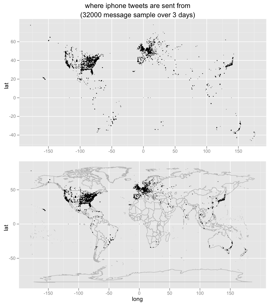
Playing around with stream.twitter.com/spritzer, ggplot2 and maps / mapdata:
I think I like the top better, without the map lines, like those night satellite photos: pointwise ghosts of high-end human economic development.
This data is a fairly extreme sample of convenience: I’m only looking at tweets posted by certain types of iPhone clients, because they conveniently report exact gps-derived latitude/longitude numbers. (search.twitter.com has geographic proximity operators — which are very cool! — but they seem to usually use zip codes or other user information that’s not available in the per-tweet API data.) So there’s only 30,000 messages out of 1.2 million spritzer tweets over ~3 days (itself only a small single-digit percentage sample of twitter).
