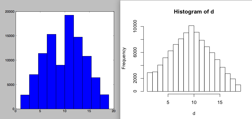
When possible, I like to use R for its really, really good statistical visualization capabilities. I’m doing a modeling project in Python right now (R is too slow, bad at large data, bad at structured data, etc.), and in comparison to base R, the matplotlib library is just painful. I wrote a toy Metropolis sampler for a triangle distribution and all I want to see is whether it looks like it’s working. For the same dataset, here are histograms with default settings. (Python: pylab.hist(d), R: hist(d))
I want to know whether my Metropolis sampler is working; those two plots give a very different idea. Of course, you could say this is an unfair comparison, since matplotlib is only using 10 bins, while R is using 18 here — and it’s always important to vary the bin size a few times when looking at histograms. But R’s defaults really are better: it actually uses an adaptive bin size, and the heuristic worked, choosing a reasonable number for the data. The hist() manual says it’s from Sturges (1926). It’s hard to find other computer software that cites 100 year old papers for its design decisions — and where it matters. (Old versions of R used to yell at you when you made a pie chart, citing perceptual studies that humans are really bad at interpreting them (here). This is what originally made me love R.)
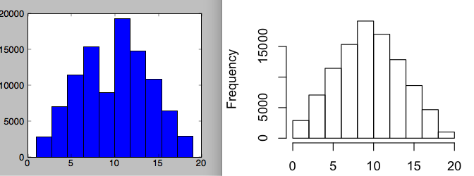
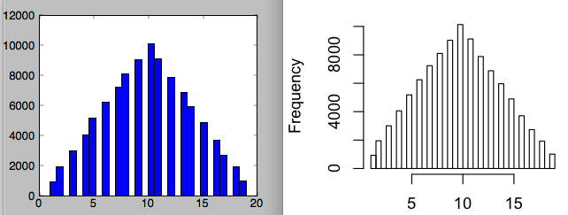
Second, R is much smarter about breakpoints. In the following plots, I’ve manually set the number of bins to 10, and then 30 for each.
The second one is now OK for matplotlib — it’s good enough to figure out what’s going on — though still a little lame. Why the gaps?
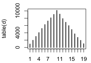
The problem is that my data are discrete — they’re all integers from 1 through 19 — and I think matplotlib is naively carving up that range into bins, which sometimes lumps together two integers, and sometimes gets zero of them. I understand this is the simple naive implementation, and you could say it’s my fault that I shouldn’t have used the pylab histogram function for this type of data — but it’s really not as good as whatever R is doing, which works rather well here, and I didn’t have to waste time thinking about the internals of the algorithm. For reference, here is the correct visualization of the data (R: plot(table(d))). Note that R’s original Sturges breakpoints did make one error: the first two values got combined into one bin.

Lessons: (1) always vary the bin sizes for histograms, especially if you’re using naive breakpoint selection, and (2) don’t ignore a century’s worth of statistical research on these issues. And since it’s hard to learn a century’s worth of statistics, just use R, where they’re compiled it in for you.


You probably know about it already, but I like using RPy to leverage R for plotting and other “better-in-R” routines.
RPy crashes like crazy for me. Do you use “rpy” or “rpy2″ ?
I used rpy. Rpy2 seemed lame.
OK I figured out my problem. RPy2 crashes like crazy. But RPy works nicely. (I installed rpy with https://gist.github.com/1732879 ). To get plotting to work, I have to start Python with “ipython –pylab”. And this seems to work for R’s graphics commands, not just matplotlib (which it’s supposed to be for). If you don’t say “–pylab”, then the plot command is unreliable.
Brendan – are you sure the R plot is really better? Just looking at the first comparison you have – R magically picked a perfect bin size that doesn’t have aliasing effects with you underlying discrete data. But it completely hides the fact that your data is discrete. It sure looks prettier, but I think the prettiness is misleading – I would guess from that histogram that the data comes from a continuous distribution.
If the possible values of your data is a small set of discrete points, why use a histogram at all?
Anyway, just a thought :). Come back to California!
Lukas — yeah it’s dumb to use histograms-designed-for-continuous-data at all; I just think the R histogram is doing better in a challenging situation.
I’m curious, if histograms aren’t optimal, what kind of exploratory visualization would you use to check the distribution shape of discrete data?
O.R.: Good question… QQ Plots are good for continuous data, of course. You can use them for discrete data, if you impose and ordering on the levels/values. This does seem artificial though.