I think game theory could benefit immensely from better presentation. Its default presentation is pretty mathematical. This is good because it treats social interactions in an abstract way, highlighting their essential properties, but is bad because it’s hard to understand, especially at first.
However, I think I have a visualization that can sometimes capture the same abstract properties of the mathematics. Here’s a stab at using it to explain everyone’s favorite game, the prisoner’s dilemma.
THE PD: Two players each choose whether to play nice, or be mean — Cooperate or Defect. Then they simultaneously play their actions, and get payoffs depending on what both played. If both cooperated, they help each other and do well; if both defect, they do quite poorly. But if one tries to cooperate and the other defects, then the defector gets a big win, and the cooperator gets a crappy “sucker’s payoff”.
The formal PD definition looks like this:

where each of the four pairs represents the (row player payoff, column player payoff) for that pair of choices. This 2×2 table, along with the constraint a>b>c>d, together capture all the properties outlined in the above paragraph. (There is usually one more constraint that a+d<2b but I'm dropping it for this discussion.) Usually it takes a few more paragraphs of prose to really explain things, but you're reading a blog and don't have patience for such silliness. Therefore the fun pictures.
First, let’s look at the group level. Is there an outcome that makes everyone happy? Or at least, is there an outcome that’s incontrovertibly better compared to another outcome? Yes, actually. This relationship is true exactly one time. Here’s a new diagram that puts in example values for the payoffs:

The (C,C) outcome gets a payoff of 2 for each person, whereas the (D,D) payoff gets 1 for each person. Compared to DD, CC is better for everyone. This is called a Pareto improvement. Therefore there is an arrow  drawn between them. The notation X
  Y means that outcome Y is a Pareto improvement over X.
There are no other Pareto improvements among the outcomes in this game, just this one (D,D)  (C,C).
Now let’s examine individual incentives. If you were playing, what should you do? You don’t know what your opponent will play, but you can reason about each situation in turn. If he is planning to cooperate, then you could either cooperate also, or else defect and exploit him. 2<3 so you'd best defect to exploit. If he is planning to defect, your choice is either to cooperate and be a sucker, or else defect as well. 0<1 so you'd best defect for self-defense.
Both players face the same incentives (the game is exactly symmetric). This diagram shows their preferences over outcomes they control. Remember, the row player’s payoffs are the left side of each pair, and the column player’s payoffs are the right side of each pair.

I’d like to have arrows connecting social outcomes, not individual outcomes, so let’s rewrite the diagram like so:

So the  marks a selfish preference aligned with a unilateral choice; that is, X
  Y means that one player could have control over whether X or Y is picked, and he prefers Y over X.
  ‘s can only appear horizontally or vertically, since they represent a relationship between outcomes that only exists between outcomes whose difference is only in the decision of one player. (The difference between the diagonal outcomes (C,C) and (D,D) requires a change by both players; it is not due to a mere unilateral choice.)
Looking at the diagram, it’s clear the individual incentives are very stark: each player should defect under all circumstances. (Arrows on both left and right point down.) There is only one outcome that only has arrows flowing in and not out: D,D. If an outcome only has incoming  arrows, and no outgoing ones, it is a Nash equilibrium. A way to think about it is, if both players are playing (D,D), there is no incentive for either to unilaterally switch away.
If we combine the diagrams, it’s easy to see why this is a dilemma. Individual incentives work in clear opposition to Pareto improvement! (There may be be other ethical concerns, such as the unfairness of the exploitation outcomes, but let’s put those aside for now. At the very least, this Pareto improvement seems to be a socially good thing.) The Pareto optimum is in a box, and the Nash equilibrium is circled.

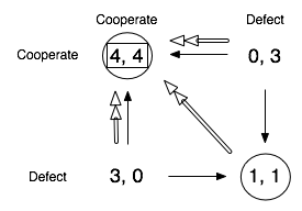
Here’s a game where cooperation is a bit easier. It’s called a stag hunt, another odd name not really worth explaining. It’s similar to a PD, except the cooperation payoff is better than exploitation payoff. (In the old language, the payoff ordering is now b>a>c>d.) Let’s use numbers again — the mutual cooperation payoff is now 4 — and jump straight to the Pareto-Improvement + Unilateral-Selfish-Choice diagram:

Now that mutual cooperation beats exploitation, the (C,C) outcome is now a Nash equilibrium, in addition to being Pareto superior over (D,D). (There are also two new Pareto improvements from C,D and D,C, just for kicks.) Now, with two NE’s on the table, it’s not clear what you should do if you were a player. If you were absolutely certain your opponent was going to defect, you should defect too just like in the PD. But if you thought he was going to cooperate, you should cooperate as well.
If both sides can coordinate their moves, then they can positively benefit at the superior and maintainable (C,C) outcome.
Whew, I think that’s it for now. I confess that I rather like diagramming out the incentive and payoff relationships between outcomes; I find it far more informative and instructive compared to staring at the arithmetic/algebraic tables and trying to figure it out in my head. Maybe I’m just not good enough at math.
To give credit where credit is due, I’ve seen the unilateral-selfish-choice arrows in only one place, Jim Fearon‘s excellent lecture notes, though he is not to blame for all this new crap I threw in. The arrows get really useful if you start working with games that have more than 4 outcomes, since as long as the game is discrete and you can lay out the outcomes in two dimensions, you usually can draw a bunch of graph edges between them. These diagrams can be completely formalized as much as the arithmetic algebra standardly used for game theory, since the visual graph over outcome nodes is just a way to writing down a set of binary relations on outcomes, and the row/column alignment stuff is just a way of showing how those relations interact with individual choices. You can easily imagine adding more arrows for different social preference functions, for elements of different solution concepts, etc.
Some people have done work with the taxonomy of 2×2 games; it might be useful to illustrate the differences (e.g. pure coordination versus pure conflict games) as outcome graph diagrams. Another post I guess…


 marks a selfish preference aligned with a unilateral choice; that is, X
  Y means that one player could have control over whether X or Y is picked, and he prefers Y over X.
