Will Fitzgerald just wrote about an excellent article by Steven Strogatz on Zipf’s Law for the populations of cities. If you look at the biggest city, then the next biggest city, etc., there tends to be an exponential fall-off in size.
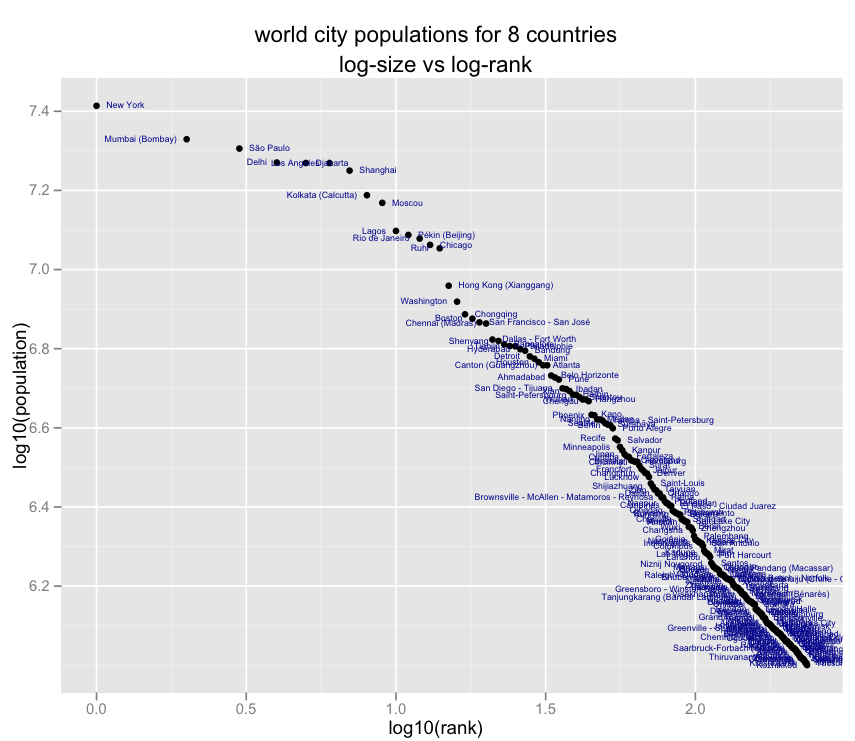
I was wondering what this looks like so here’s the classic zipfian plot (log-size vs. log-rank) for city population data from from populationdata.net:
If you fit a power law — that is, a line on the above logsize-logrank plot — you can use rank to predict the sizes of smaller cities very accurately, according to Will’s analysis. Larger cities are more problematic, lying off the line.
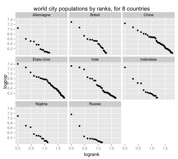
I was curious whether the power law holds within countries as well. The above plot was only for the countries that had more than 10 cities in the dataset — just eight countries. So here are those same cities again, but plotted against ranks within their respective countries.
The answer is — usually, yes, the power law looks like it holds within countries as well. (Country names are French in this data … Etats-Unis = USA, Allemagne = Germany, etc.) Russia seems to have the biggest difference between its head vs. tail cities. The tail cities have the linear logsize-logrank relationship, but the top 3 cities (Moscow, St. Petersburg, Nizhny Novgorod) seem to have their own different slope.
If you randomly subsample out of a Zipf distribution, the samples will be Zipfian as well, so this isn’t too surprising. If, on the other hand, you’re a fan of theories that power law population relationships might happen as a result of the structural dynamics of growth — for example, winners-win (i.e. rich-get-richer) growth patterns can sometimes result in zipf-distributed sizes — then there’s a case that these dynamics might be happening at both the world and country levels.
Also: this is the first time I’ve used Hadley Wickham‘s ggplot2 and it was great. All of the fun of lattice minus a lot of the pain, plus default display options that aren’t ugly as hell :)
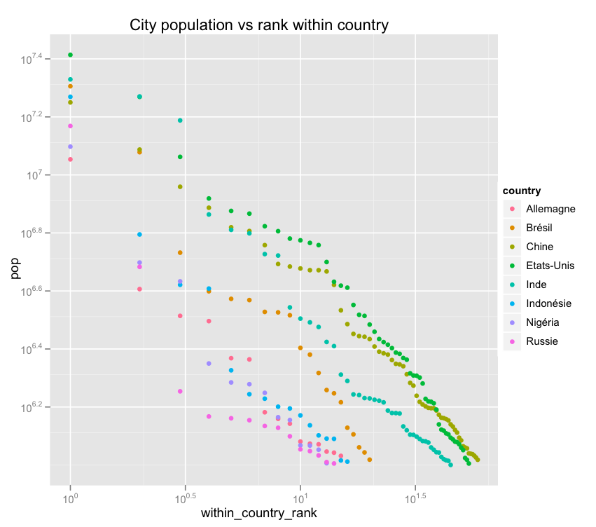
Update: alternative view of those two above graphs.
This was brought to you via the following R code:
d=read.delim(‘cities.tsv‘,header=T)
bigs=names(table(d$country))[table(d$country) > 10]
x=d[d$country %in% bigs,]; x=x[order(-x$pop),]
plot(log10(pop) ~ log10(1:nrow(x)), data=x, main=’World city populations for 8 countries\nlogsize vs logrank’, col=’darkred’)
text(x=log10(1:nrow(x)), y=log10(x$pop), labels=x$city, pos=ifelse(1:nrow(x) %% 2 == 1, 4, 2), cex=.5, col=’gray30′)
# or better
library(ggplot2)
qplot(log10(1:nrow(x)), log10(pop), data=x) + geom_text(hjust=ifelse(1:nrow(x) %% 2 == 1, 0, 1),label=sprintf(” %s “,x$city),size=2,colour=’darkblue’)
library(plyr)
xr=ddply(x, .(country), function(x) { x=x[order(-x$pop),]; ranks=(1:nrow(x)); data.frame(x$city, logpop=log10(x$pop), logrank=log10(ranks)) })
qplot(logrank, logpop, country, data=xr, facets=~country, main=’world city populations by ranks, for 8 countries’)
# alternate views
xr=ddply(x, .(country), transform, within_country_rank=rank(-pop))
qplot(rank(-pop),pop, data=xr, log=’xy’,colour=country, main=’City population vs rank across countries’)
qplot(within_country_rank,pop, data=xr, log=’xy’,colour=country,main=’City population vs rank within country’)


Instead of
ddply(x, .(country), function(x) { x=x[order(-x$pop),]; ranks=(1:nrow(x))
I think you could do:
ddply(x, .(country), transform, ranks = rank(pop))
which as well as being more elegant, will also deal better with ties.
And thanks for the kind words about ggplot2 :)
on ddply with transform/subset/etc — yes! I discovered that after. I was always wondering what the point of those functions were … I guess to be exploited by a library written long after core R that makes much more use of lazy evaluation than then native *apply’s …
ggplot is great, isn’t it!
About your city-size analysis, where the largest cities are larger than expected, I suspect that this happens when a country is “truncated” compared to its former colonial or imperial extent. Moscow, Vienna, London, Brussels, Berlin, Delhi would be examples of this. (You might expect it for Istanbul as well, but Ataturk moved the capital to Ankara….).
-s
ah, very interesting point. so they were on a logspace-linear curve in the great old empire but are now stuck being too big for the smaller little truncated nation they’re now the capital of…
Are you sure they aren’t lognormal?
yeah they probably are honestly. i was originally trying to figure out if/how sorting samples from a lognormal becomes powerlaw … but got sidetracked into these plots which are just too interesting :)
I love these “chi by eye” experiments. How would you reject something being a power law?
If you look at Chinese Restaurant Processes, or their generalizations, Pitman-Yor Processes, they have a nice “explanation” of why data such as these might follow power laws.
Hi There – Very cool charts! Was wondering if I could use or more of them in a presentation about society and demographics in the 21st century. Please email me if that’s OK – They are very descriptive of some trends we are discussing in some of our lessons.
Many Thanks,
DKO
Pingback: Mathematics.. A discovery or an invention? « Tentative Conclusions
Thanks for sharing. I got the following error when plotting with the following code.
qplot(log10(1:nrow(x)), log10(pop), data=x) + geom_text(hjust=ifelse(1:nrow(x) %% 2 == 1, 0, 1),+ label=sprintf("%s",x$city),size=2,colour='darkblue')
Error: When _setting_ aesthetics, they may only take one value. Problems: hjust,label
Pingback: Irish Banks : Arrears, Deposits, Bail-in and Interest Rate Editon | Brian M. Lucey
Pingback: A System Collapse Framework for Societies | 1913 Intel