Here’s a re-plotting of a graph in this 538 post. It’s looking at whether pilots speed up the flight when there’s a delay, and find that it looks like that’s the case. This is averaged data for flights on several major transcontinental routes.
I’ve replotted the main graph as follows. The x-axis is departure delay. The y-axis is the total trip time — number of minutes since the scheduled departure time. For an on-time departure, the average flight is 5 hours, 44 minutes. The blue line shows what the total trip time would be if the delayed flight took that long. Gray lines are uncertainty (I think the CI due to averaging).
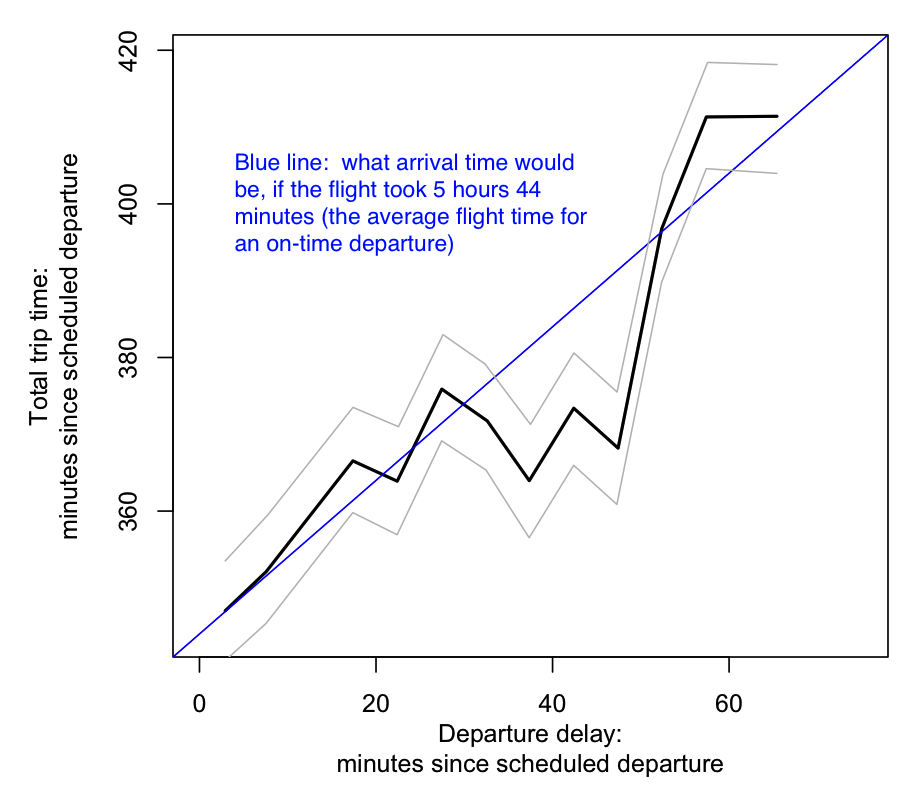
What’s going on is, the pilots seem to be targeting a total trip time of 370-380 minutes or so. If the departure is only slightly delayed by 10 minutes, the flight time is still the same, but delays in the 30-50 minutes range see a faster flight time which makes up for some of the delay.
The original post plotted the y-axis as the delta against the expected travel time (delta against 5hr44min). It’s good at showing that the difference does really exist, but it’s harder to see the apparent “target travel time”.
Also, I wonder if the grand averaging approach — which averages totally different routes — is necessarily the best. It seems like the analysis might be better by adjusting for different expected times for different routes. The original post is also interested in comparing average flight times by different airlines. You might have to go to linear regression to do all this at once.
I got the data by pulling it out of 538′s plot using the new-to-me tool WebPlotDigitizer. I found it pretty handy! I put files and plotting code at github/brendano/flight_delays.